NAVA
Branding proposal
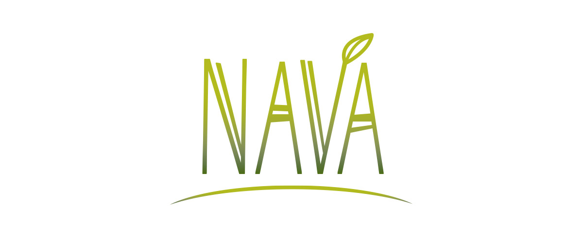
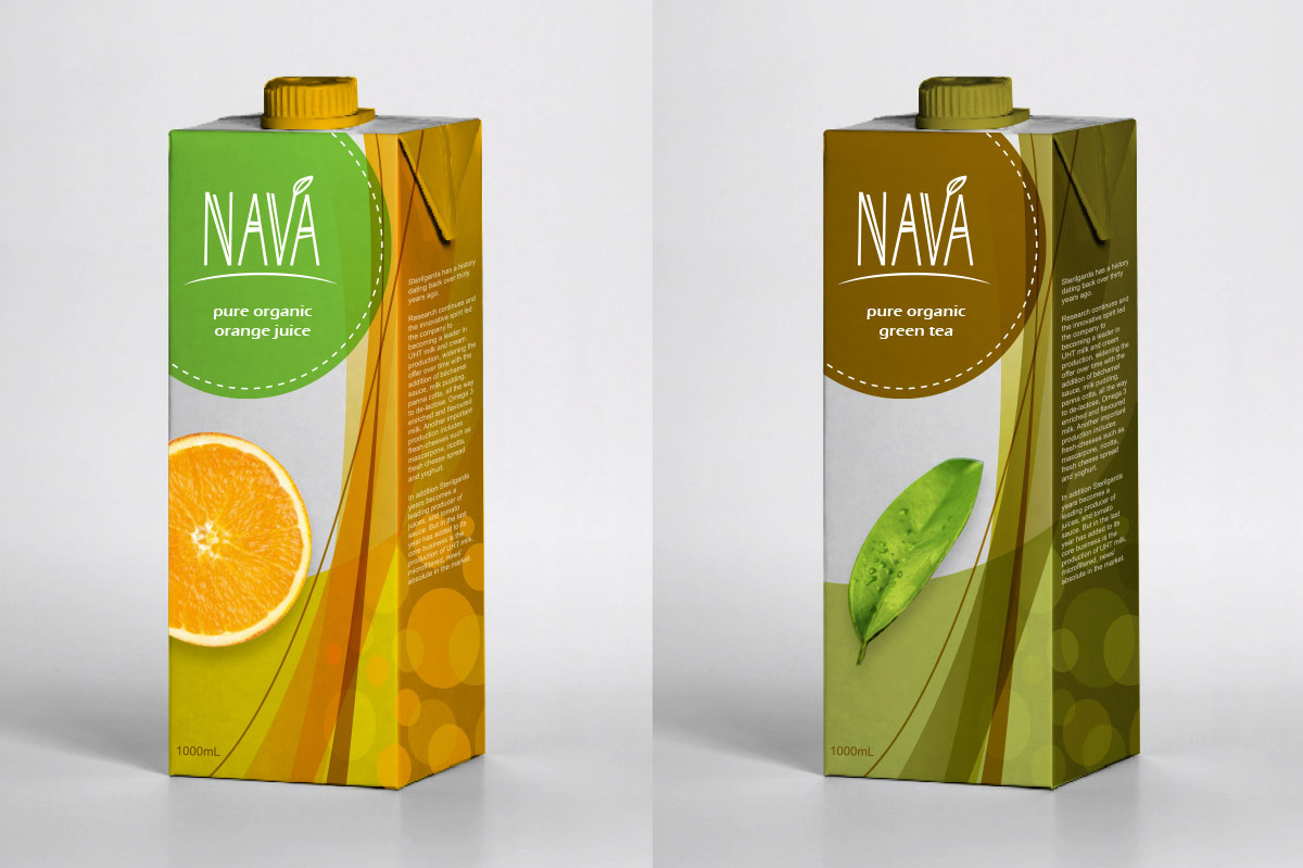
This was a brand design proposal developed for Sterilgarda Alimenti, an Italian leading company in the production of UHT milk and cream. NAVA brand was a proposed concept for their new line of natural beverages. The concept behind NAVA was the combination of the Italian words Naturale (Natural) and Vita (Life). The brand communicates a message of rejuvenation from within. The name “Nava,” or one’s natural life force, rises from the arc which represents the horizon of mother earth. This symbolizes the renewal of one’s inner being through a return to nature. The clean and simple lines highlight the connection between a pure beverage and the joys of a simple life. The color palette was inspired by elements found in nature, such as fallen eucalyptus leaves and the early morning sun. Earthen tones suggest harmony with nature, while vibrant hues awaken feelings of energy and vitality. The playful, crafted look appeals to the target audience: a youthful, trendy and eco-friendly generation.